Lovers' Dew Case Study
October 22nd, 2024
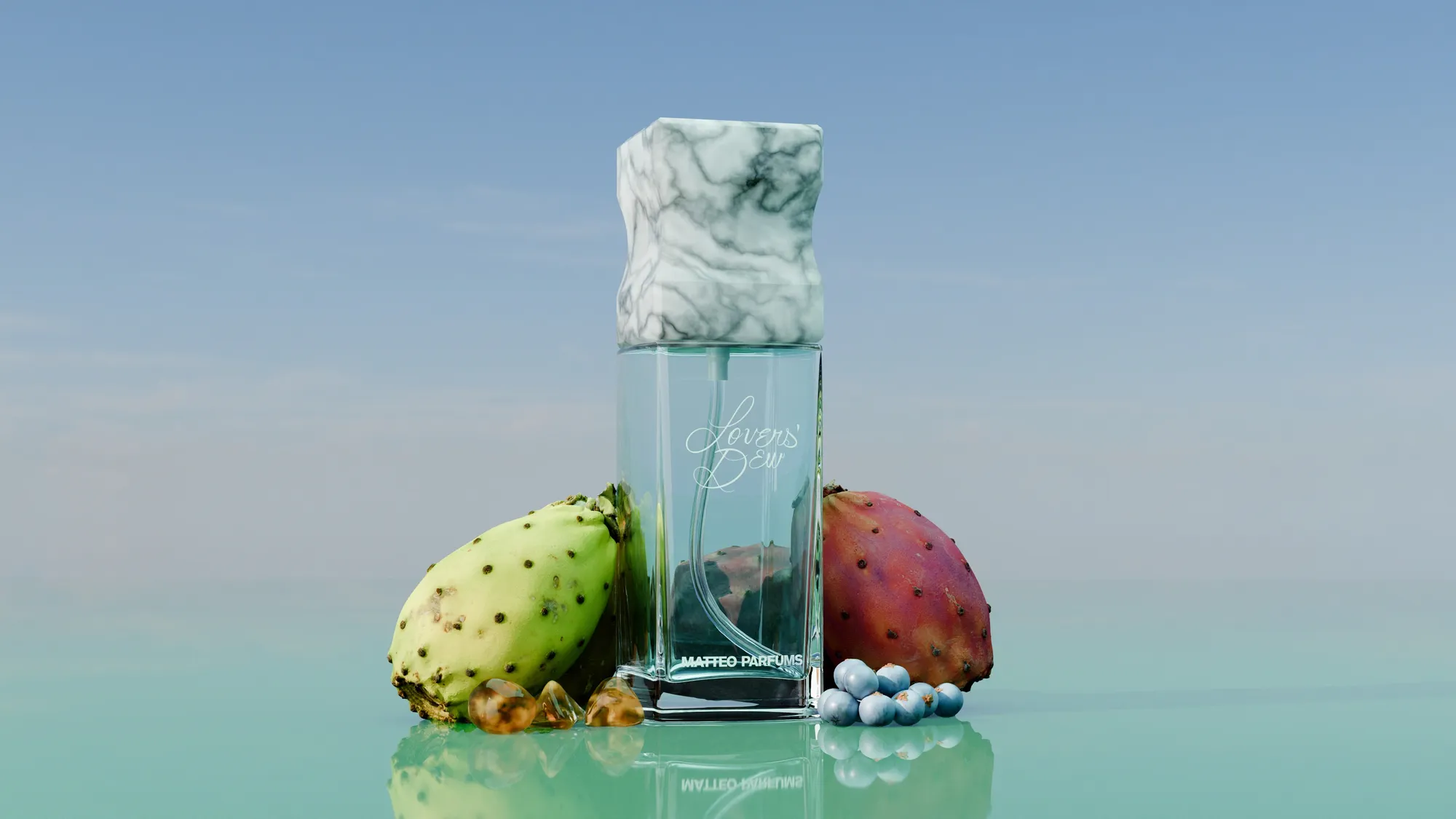
In August 2024, I reached out to Matthew Sanchez on Twitter when he said that he was looking for a designer to produce high-quality 3D renders of his upcoming fragrance Lovers' Dew. This blog post is about the process behind the 3D modelling, the concept research phase and the execution for the whole project, which you can check out here.
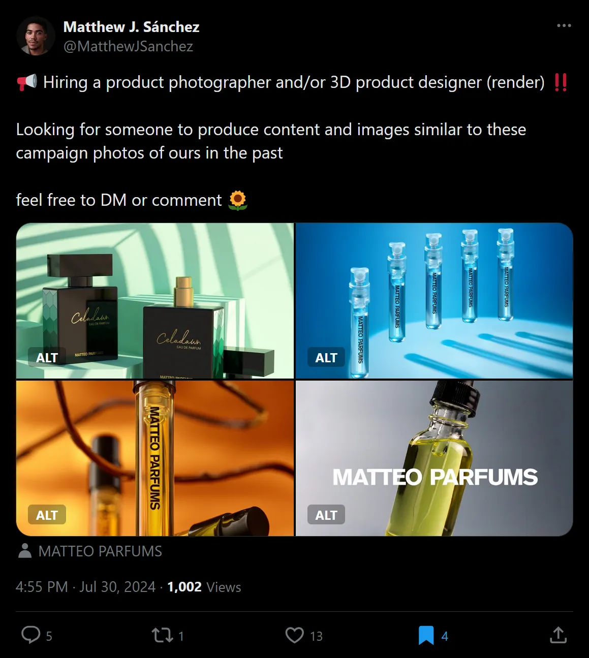
Initial brief
This project involved creating six renders for Matteo Parfums' new fragrance called "Lover's Dew". The initial brief from the client included a written description of the creative direction and a few online references of existing fragrances and how each one advertised themselves on their respective marketing and online store.
The deliverables were six renders of the Lovers' Dew perfume bottle in two distinct categories: three e-commerce renders of the bottle on a white background and three more "beauty" images showcasing the perfume in more creative settings.
3D modelling in Plasticity
Since the client had already manufactured the perfume bottles, I thought that he had 3D models ready for me to use but that wasn't the case. Fortunately, he had provided me with some 2D drawing diagrams straight from the manufacturer for the glass bottle and the spray nozzle. So I was not worried about modelling these components accurately.
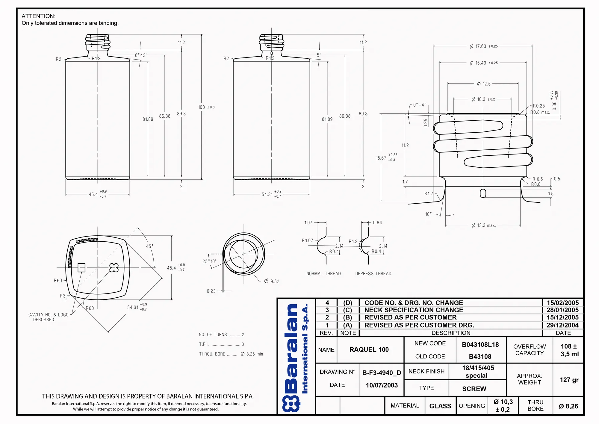
At first, I thought of modelling everything straight in Blender but the benefits of modelling in Blender (easier UV unwrapping, using the Blender modifiers) did not outweigh the benefits of modelling in Plasticity (peace of mind in terms of surface editability, surface quality and most important of all, accuracy).
I realized this very early on because the top profile of the glass bottle is made up of four intersecting circles of a radius equal to 60mm. If I wanted to make those four circles at the right radius (which is easy) but with the right number of vertices that that the intersection of each mesh circle overlap with another circle's vertices, that would have been a nightmare to calculate.
It is possible to make pretty accurate geometry using Blender. But the modelling process is flaky, involves more steps, isn't as accurate or flexible and leaves the door open for small mistakes such as moving a vertex by accident.
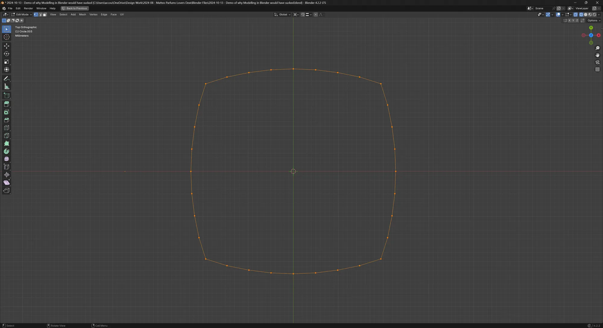
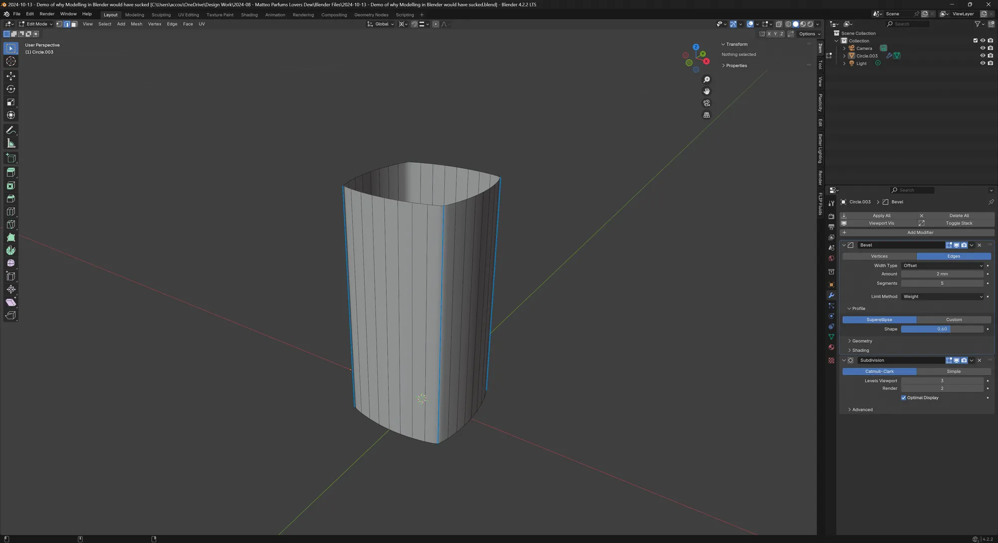
When I was thinking ahead at the amount of work it would take to make small changes to the dimensions or the amount of vertices in the main surfaces (and how it would affect bevels and subdivision surfaces down the line), I immediately committed to modelling everything in Plasticity.
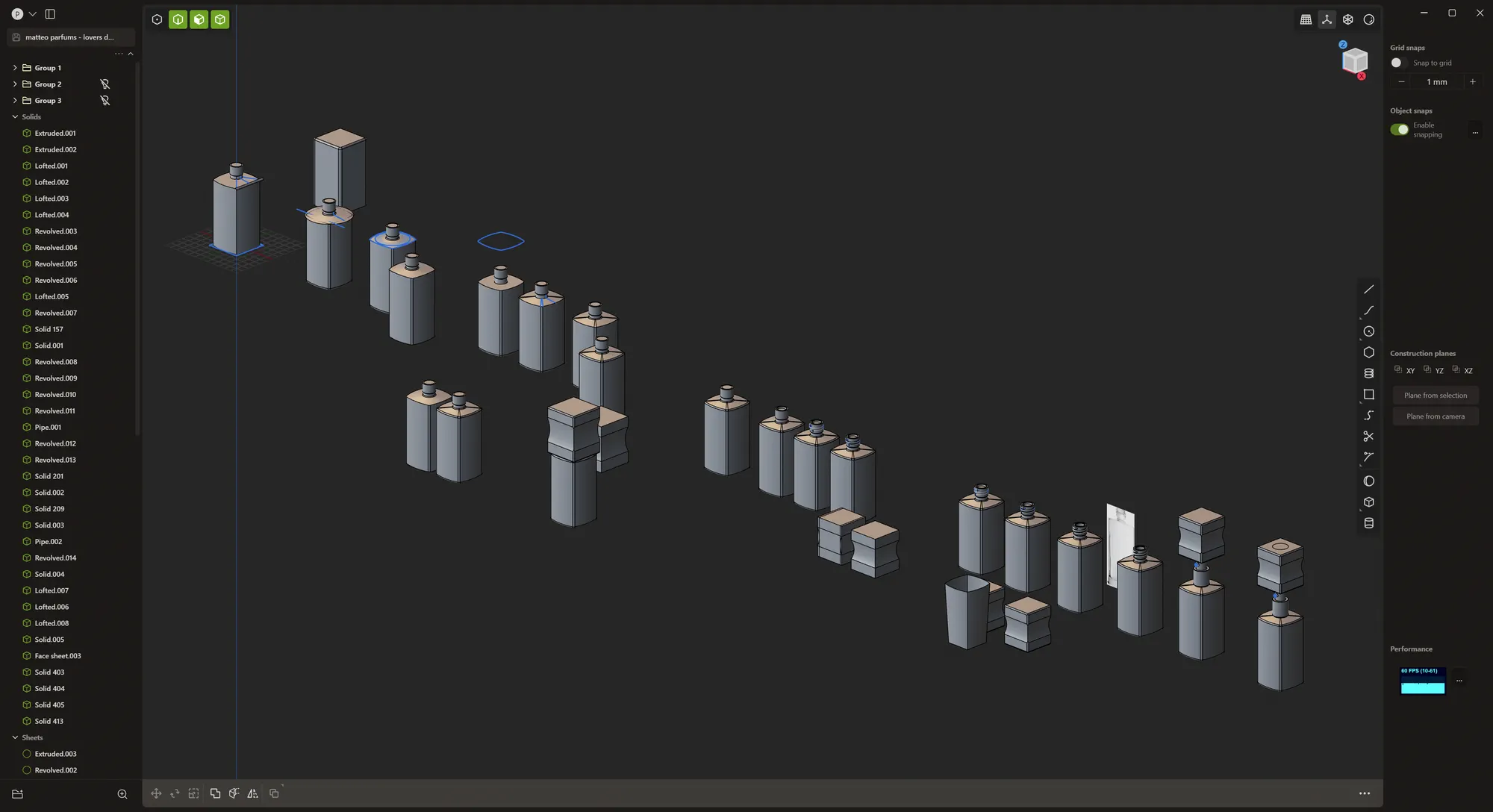
Modelling in Plasticity was actually a fairly straightforward process. I know that in Plasticity, you cannot easily edit the G2 fillets like you can with the G1 fillets, so I resorted to creating many versions of the same geometry inside of the same file at each main step of the process.
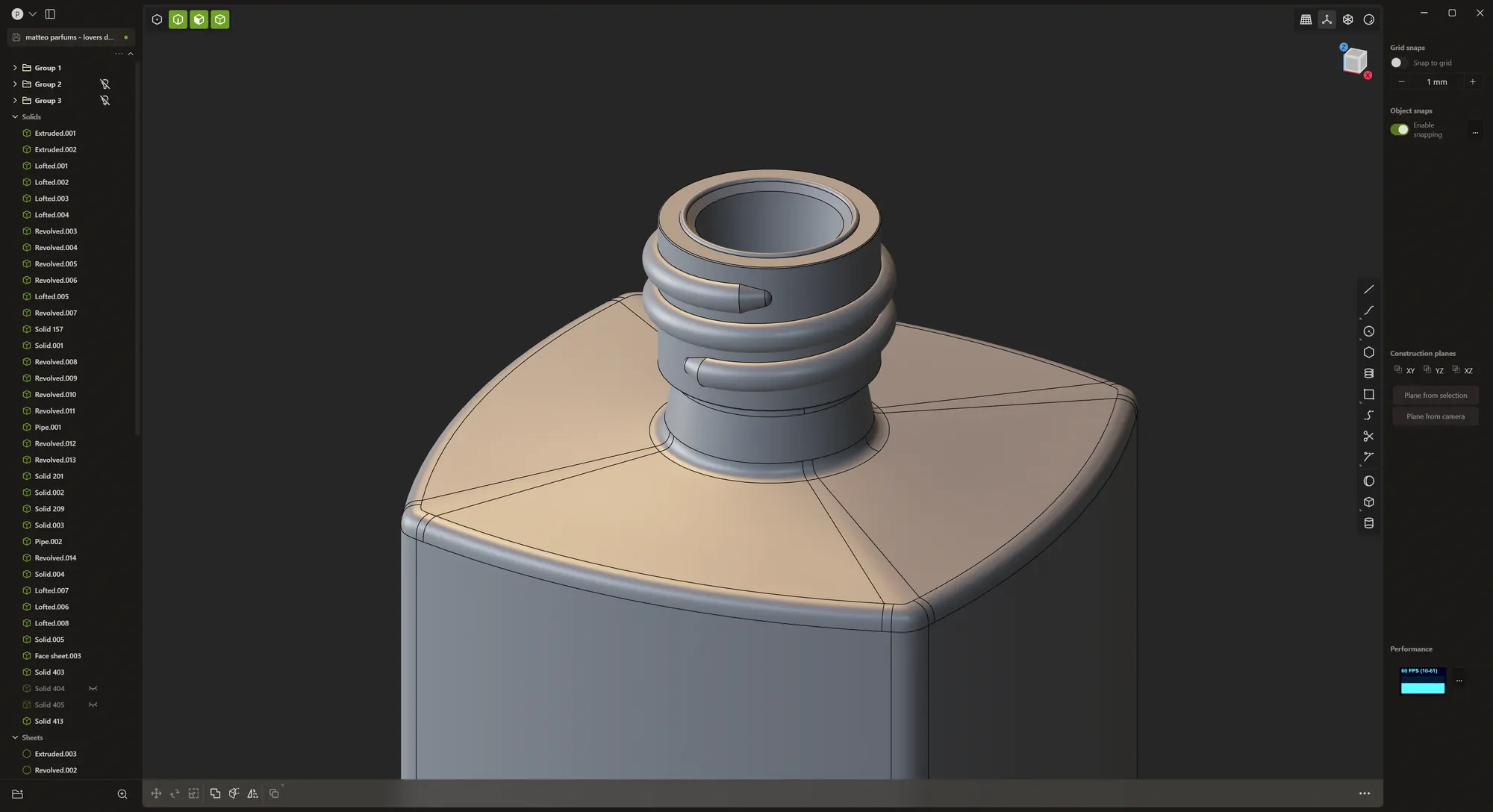
I also very much enjoyed modelling small details that likely nobody would ever see such as the corkscrew for the spray nozzle on the neck of the glass bottle.
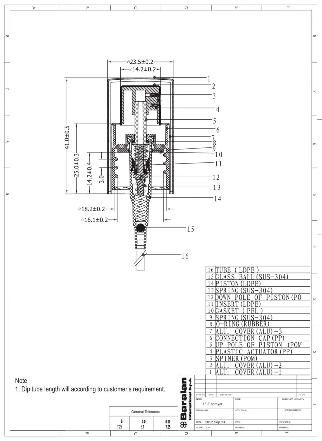
When I got to the stage of modelling the spray nozzle, the client kindly provided the diagram for me.
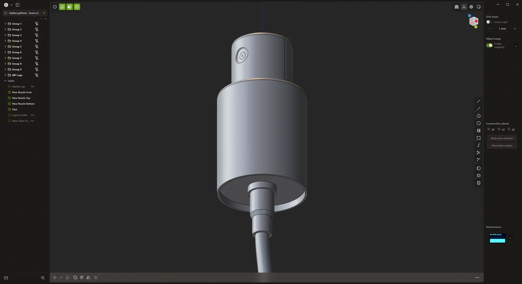
Within a few minutes, I had a fully modelled accurate and editable spray nozzle.
Correcting the mistakes in the vector logo
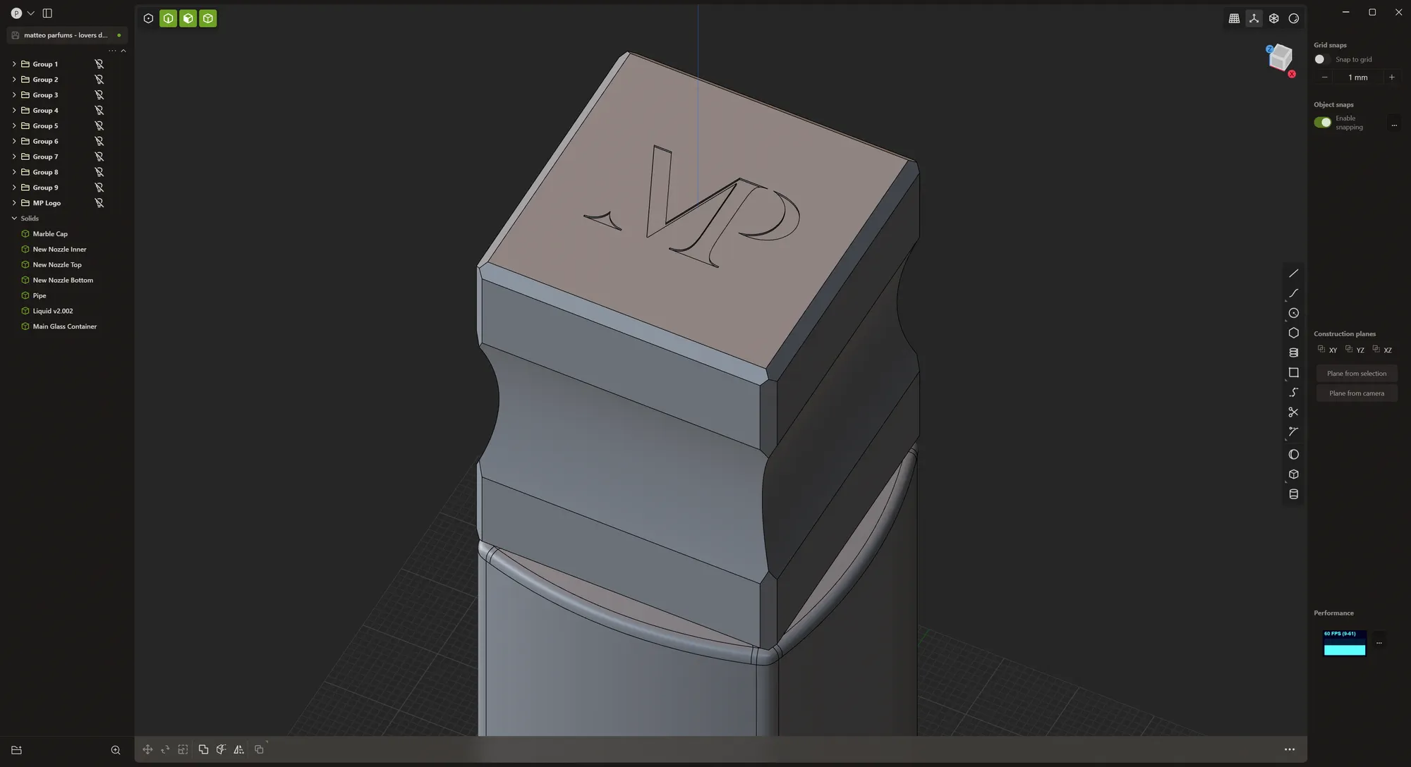
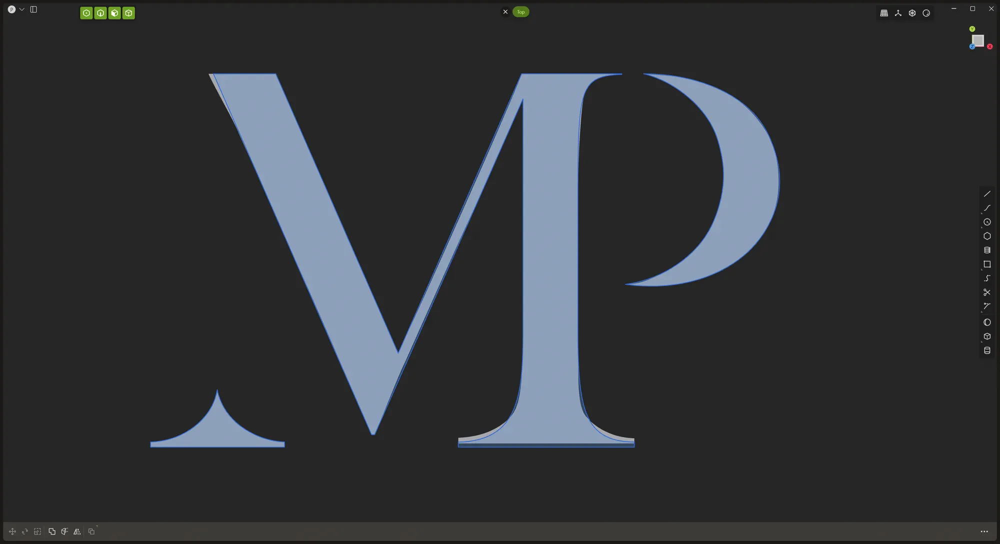
As for the marble cap with the embossed "MP" wordmark on top of it, I wanted to avoid the hassle and imprecision of doing it through a texture, so I decided to do it with real geometry with a boolean subtract. The client has his logo in a vector format but I noticed some slight inaccuracies in the vector artwork so I manually retraced the logo to get everything lined up correctly.
Here were the differences between the provided vector artwork (in white) and the corrected version (the blue outline).
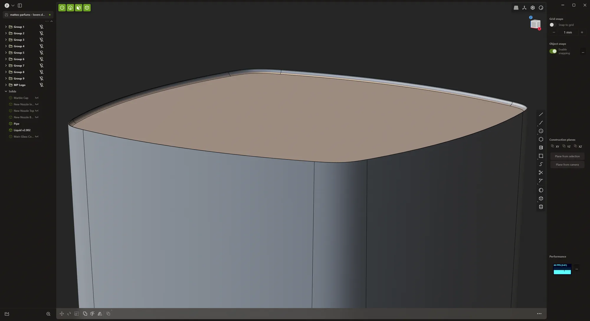
The last detail I wanted to add with Plasticity was the liquid with the surface tension. With a quick boolean operation and fillet, I had everything I needed.
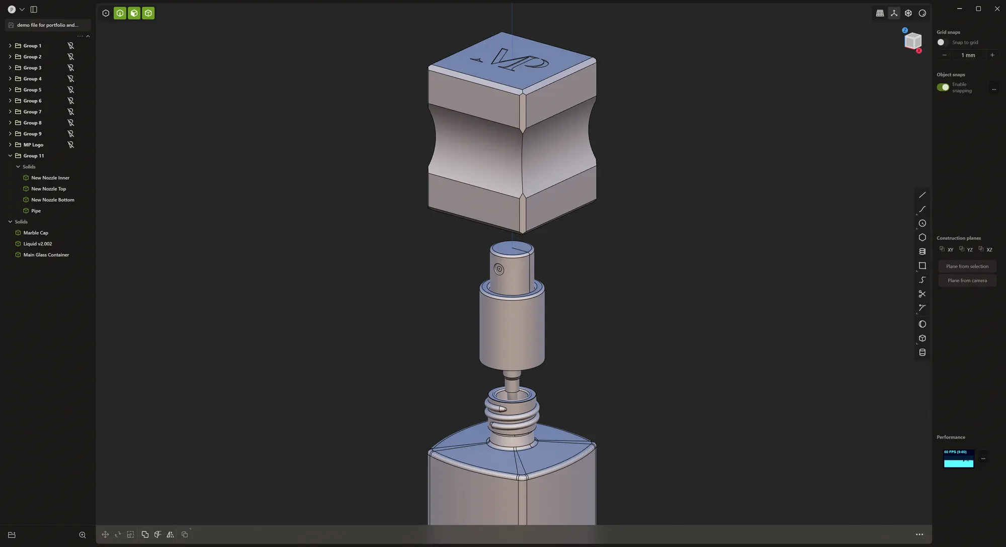
And here is a screenshot of the important details from the finished model:
Material shading in Blender
Now that I had everything related to the perfume bottle modelled, the next step was to figure out the material shaders for the various parts. Most important of which were the glass shader and the marble cap.
The goal was to use as many procedural material shaders as possible. They might be slower to render but they consume much less VRAM since they don't need to store all of the maps on there. Plus, the flexibility of tweaking every imaginable aspect of the shader is great when I or the client is looking for a specific look.
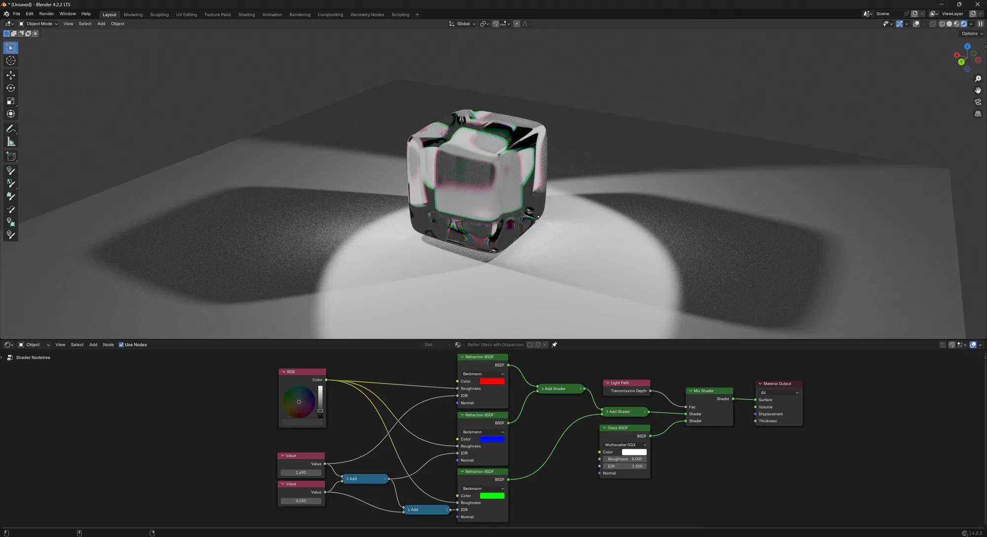
For the glass shader, I already had a pretty interesting look. It features a mix of three refractive shaders and one white glass shader.
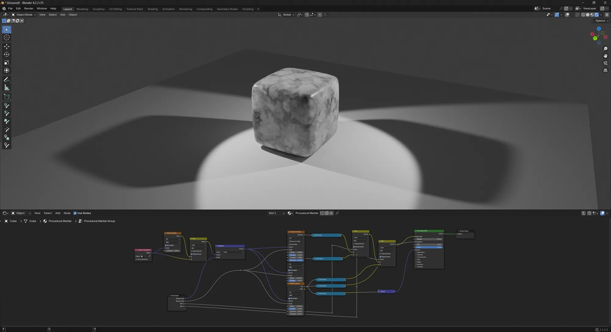
I also happened to have a very versatile procedural marble material in my Blender asset library.
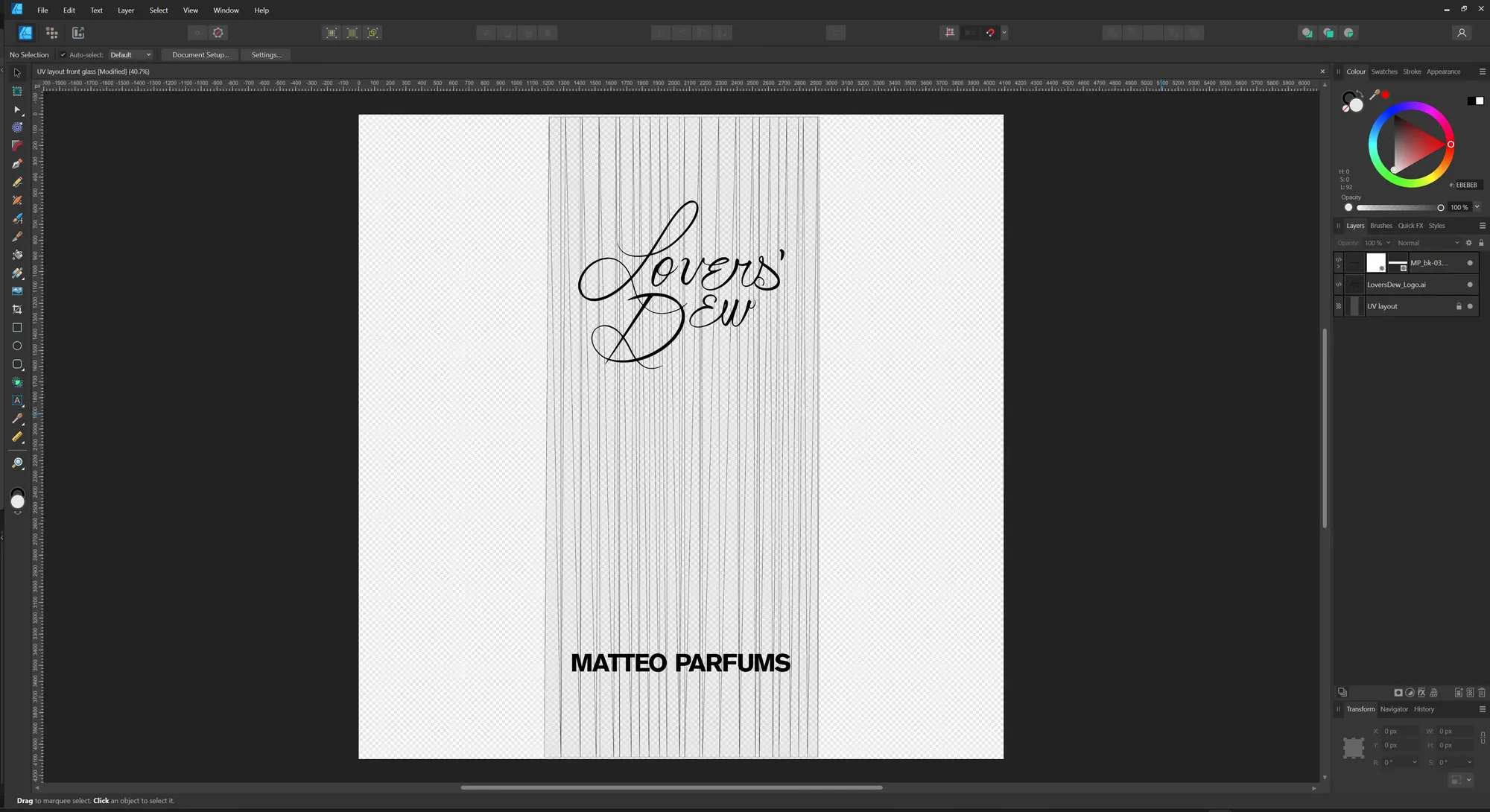
The only place where a texture had to be used was the front label of the glass bottle, showing "Lovers' Dew" and "MATTEO PARFUMS". I exported the UV layout of that front face from Blender and laid out the vector artwork in Affinity Designer 2.
The issue with compositing glass
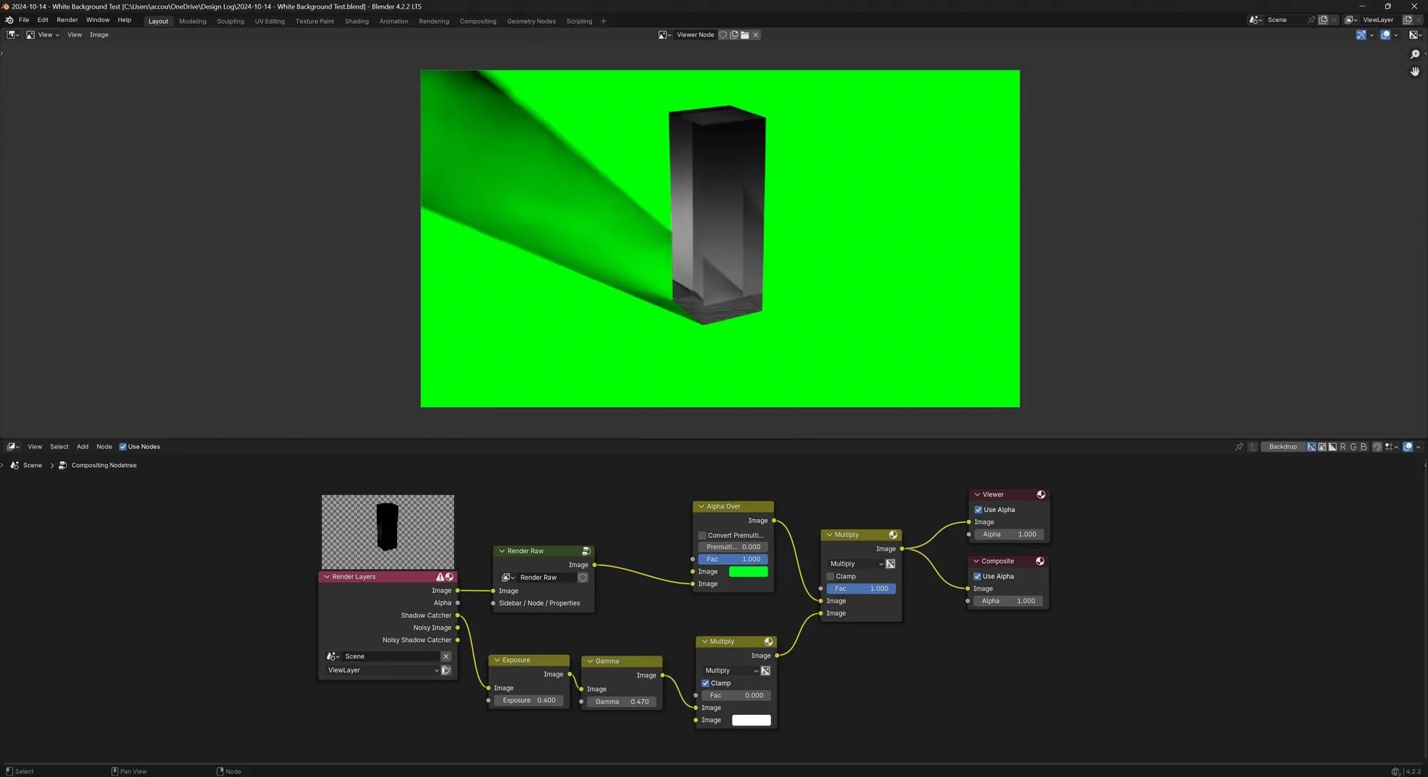
After many attempts of rendering with a transparent background and using a background wall or ground geometry with "Shadow Catcher" and "Holdout" checked on in the Object properties, the compositor in Blender would not give me a pure white as a background although the "Set Alpha Over" node specifically used pure white! And since the "Set Alpha Over" node was after the adjustments made by the Render Raw add-on, I was extremely confused as to why I still didnt' get pure white on my background.
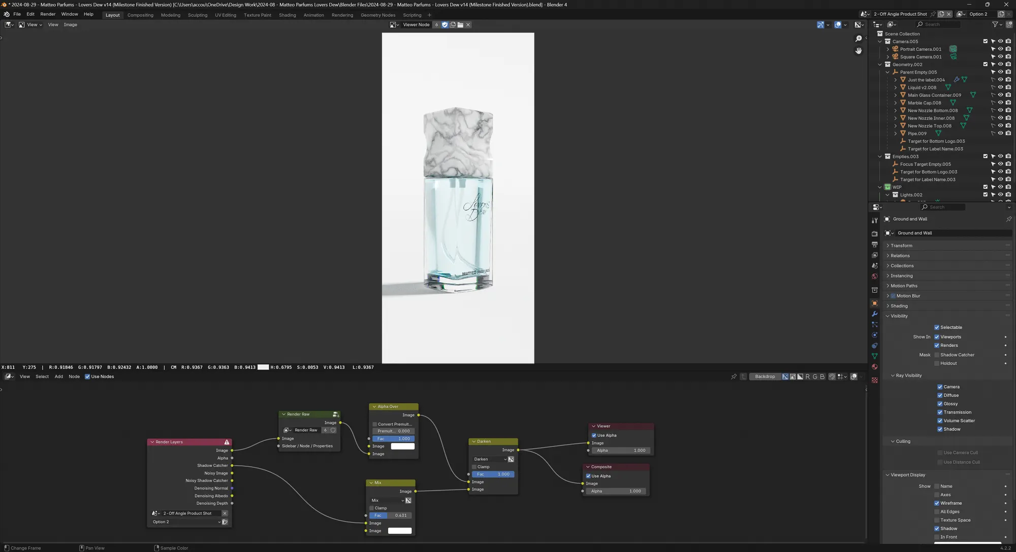
As shown with the example below with a green background for illustration purposes, the glass render does not have alpha values that show the green background to pass through it. So even if the workflow had been successful, it still wouldn't have solved all of my issues.
While working on this project, I also noticed that despite the recent improvements with the compositor, especially GPU compositing, there are still a few papercuts (dragging nodes is very laggy when the compositor is working on the viewport) and when working on many scenes like I did, Blender has the bad habit of displaying data objects like shaders, nodes and empties from other scenes - which was very annoying and confusing. For example, when trying to preview the "Viewer" Node inside of the Compositor, the Image Editor dropdown would display other viewer nodes and I never knew which one was which.
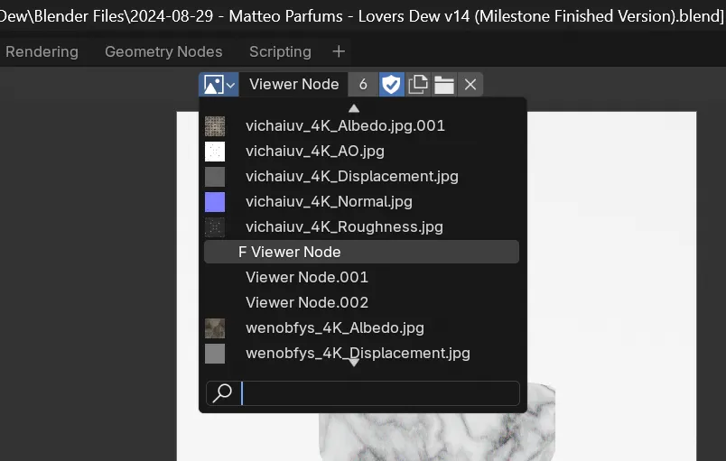
In the end, I had to give up on using the Compositor because it forced me to either:
- not have a perfect white background
- not have perfectly rendered shadows - the compositor would absolutely fudge those
Not to mention that sometimes, checking on the "Holdout" checkbox on the ground/wall geometry would inexplicably remove the shadow from the render. In conclusion, working with the compositor aside from doing color grading was a complete and utter nightmare because of the transparent glass.
Research and moodboards
The client had provided about a half dozen references of existing work from established brands. I set out to create an extensive mood board in PureRef to always refer to and share with the client.
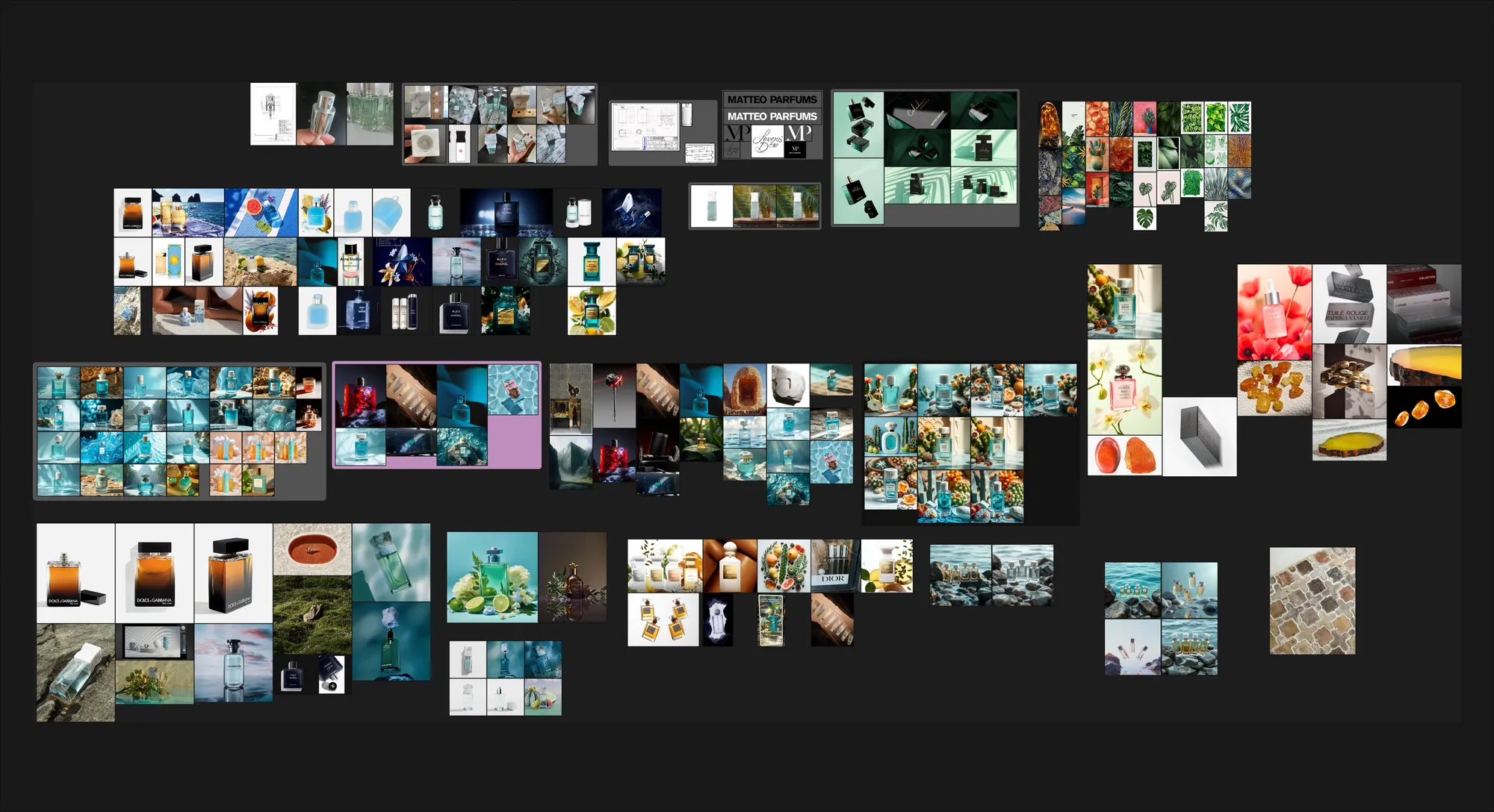
My initial ideas were to convey the serene qualities of water in various ways. I thought that doing proper fluid simulations was too ambitious and too deep of a rabbit hole for my very first attempt at this kind of work, so I looked at other ways of suggesting the presence of water.
After a bit of research and experimentation, I suggested to Matthew that we could go for a couple of underwater shots without doing fluid simulation, simply by using fake caustics and volumetrics.
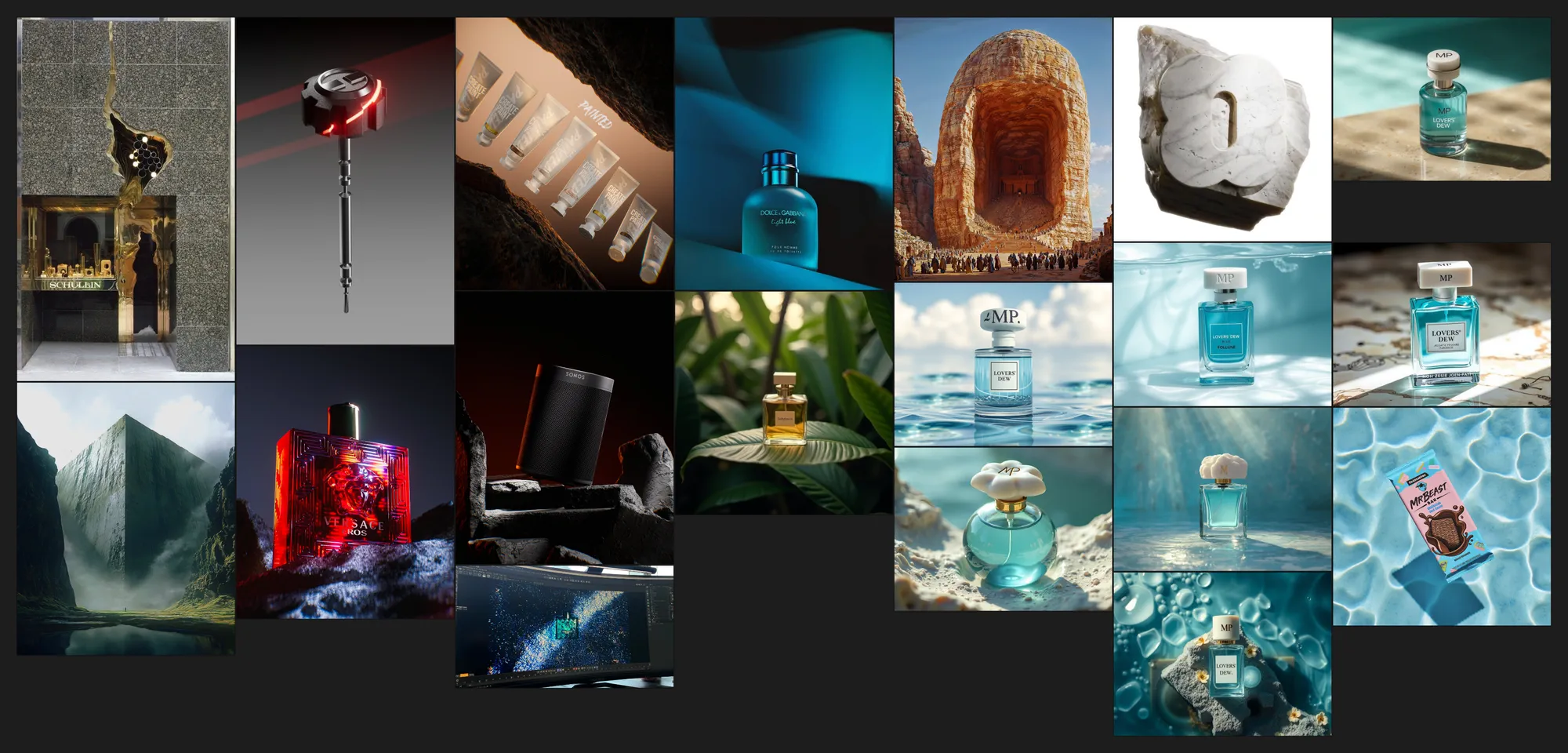
The overall shots could be enhanced with various props and lighting tricks such as volumetrics, light rays, particles and caustics.
But the initial ambition with the client was to use 3D models that represented the tones of the fragrance. To save time for the approval of the creative direction, I used the Flux generative AI model on Fal.ai. If you're interested, here are the links to the Schnell model and the Pro model.
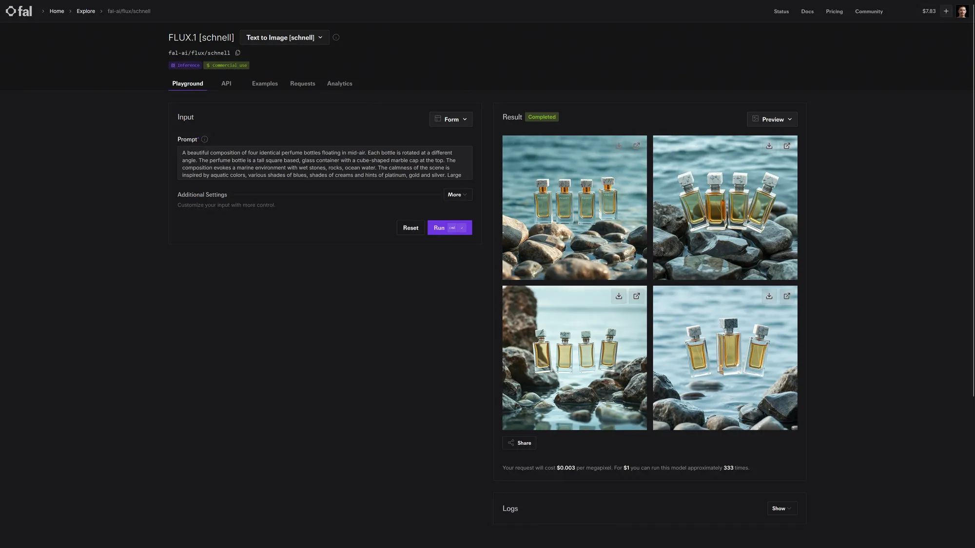
I started using these inspiration shots to make the initial sketch renders but I still wanted to have more suggestions and stumble on happy accidents along the way. One of the many tools I used to do that was Supercraft AI. I found out about it while working on this project stumbled on their YC launch page, so I immediately joined the Supercraft AI Discord server, gave some feedback about the product and Sarang the CEO reached out through a call to find out more.
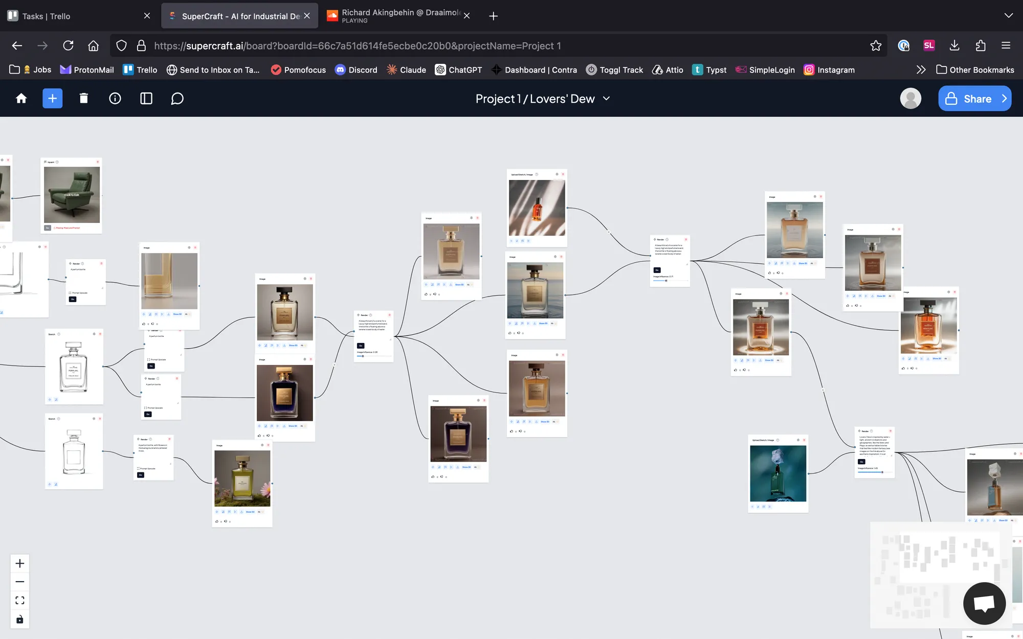
By using my own renders from Blender, screenshots and images taken online, I was able to quickly generate more ideas fairly precisely using the blend feature. While its primary purpose is to help industrial designers with concept modelling, I found it useful to add variations and details when an image's composition or layout was already pleasant. You can check out the Supercraft project board here.
After some further discussions with my client Matthew, we settled on an initial design direction thanks to the following Flux-generated images:
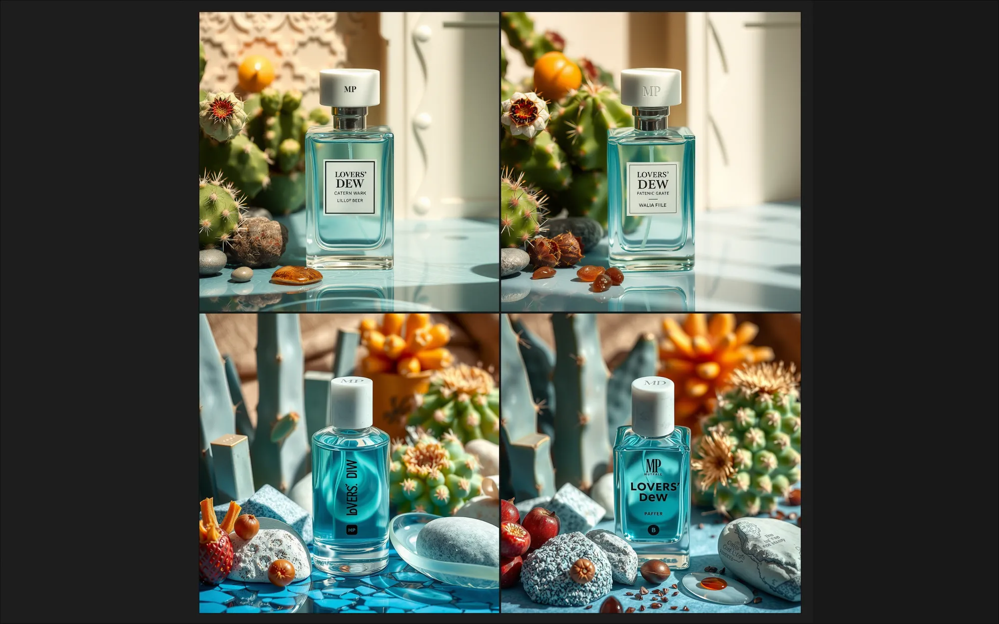
Before even considering this approach seriously, I was well aware that I wouldn't be able to 3D model organic fruits, flowers and cacti in a cost-effective manner. So I set out to find ready-to-use 3D assets on platforms such as Sketchfab, Quixel Megascans, Artstation Marketplace and Turbosquid.
It was my first time having to rely on such platforms for professional work and let's just say that some of my doubts were justified. Here are some of the assets I bought:
However, I was quite disappointed at the texture quality of most of these models. Even the most expensive asset, the pomelo, featured sub-par textures for the skin and the pulp of the fruit, making it unusable as hero assets. And because I had purchased the assets from least expensive to most expensive, I was left holding the bag...
But I did learn a lot throughout this phase of this project. There were some promising layout using the props and certain free cloud VDBs that I downloaded from Janga FX's website. And because I was struggling to get pleasant results in the shading of the volumetric clouds, I looked for guidance on YouTube and I found this excellent tutorial made by Marc Whitelaw, a lead artist at Industrial Light & Magic.
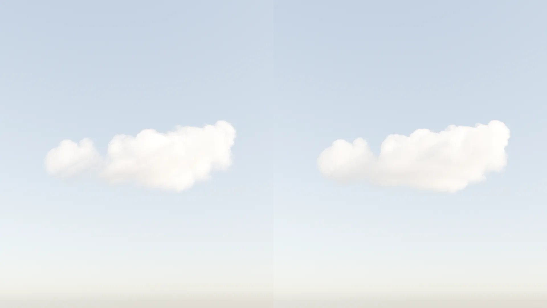
Left: a principled volume shader with low density. Right: the custom setup described in Marc's tutorial
Researching digital human solutions for Blender
At this point, I had wasted precious time and effort pursuing an approach that turned out to be unworthy. So I had to redouble in my efforts in finding an idea that was both attractive and feasible.
Matthew suggested to use human models to showcase the perfume bottle using partial nudity in a tasteful way. At first, I was reluctant because digital humans are known to be difficult to pull off, but I decided to try it anyway.
I remembered learning about Humanify on Twitter a few months ago so I started my investigation into digital humans for Blender there. As it turns out, since then they have released a new set of hyper realistic skin textures called Global Skin.
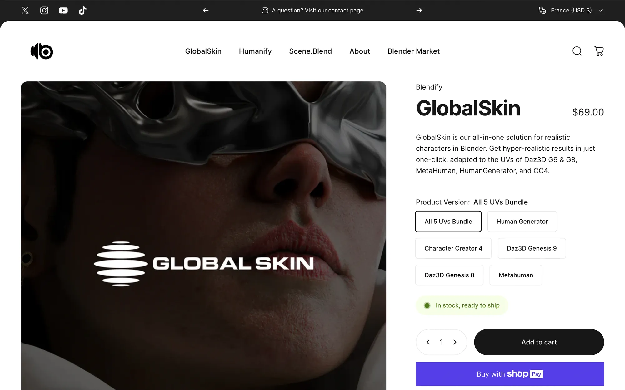
Although this set of textures wasn't what I was looking for, it gave me good pointers as to where to find industry-standard, high quality digital humans to use in Blender, such as:
- Human Generator
- Metahuman
- Daz3D Genesis 9 and 8
- Character Creator 4
Human Generator

Human Generator seemed appealing at first because it is the only product that was designed for Blender use. It's a third-party Blender add-on that creates fully customizable and rigged digital human charaters. But there is no trial and I wasn't too comfortable shelling out cash for a solution that wasn't going to work for me 100%.
Metahuman
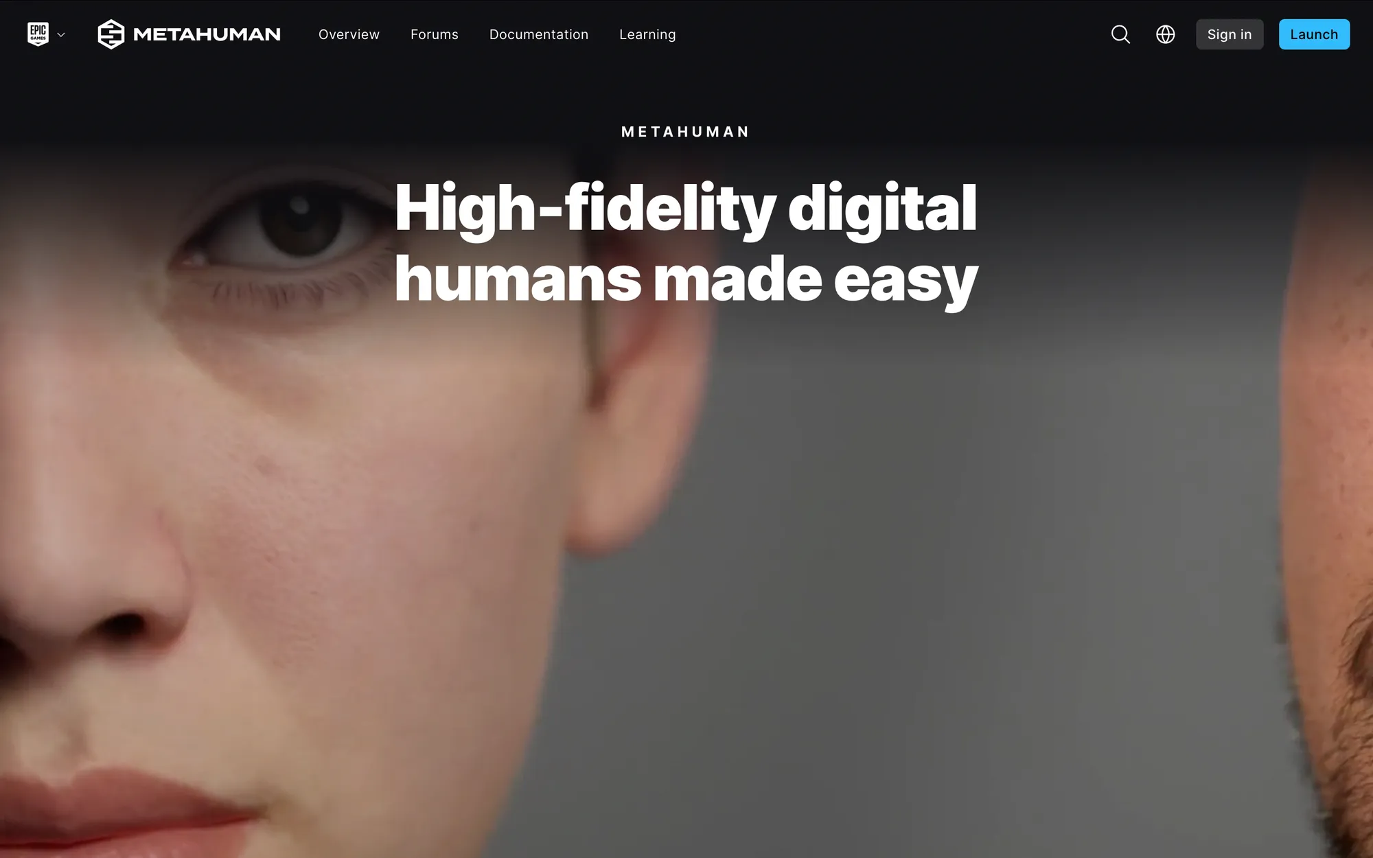
Epic Games's digital human solution, Metahuman, is industry-leading but its assets cannot be rendered outside of Unreal Engine without breaking its terms of service.
Daz3D
Daz3D was by far my most disliked product. Don't get me wrong - on one hand, I was glad that it offered me a way to try out their product for free, but on the other hand, their website and product offering is confusing (Their software is free of charge, but access to the 3D models is monetized with tons of paid customisations that cause information overload and ultimately convined me to look for another solution).
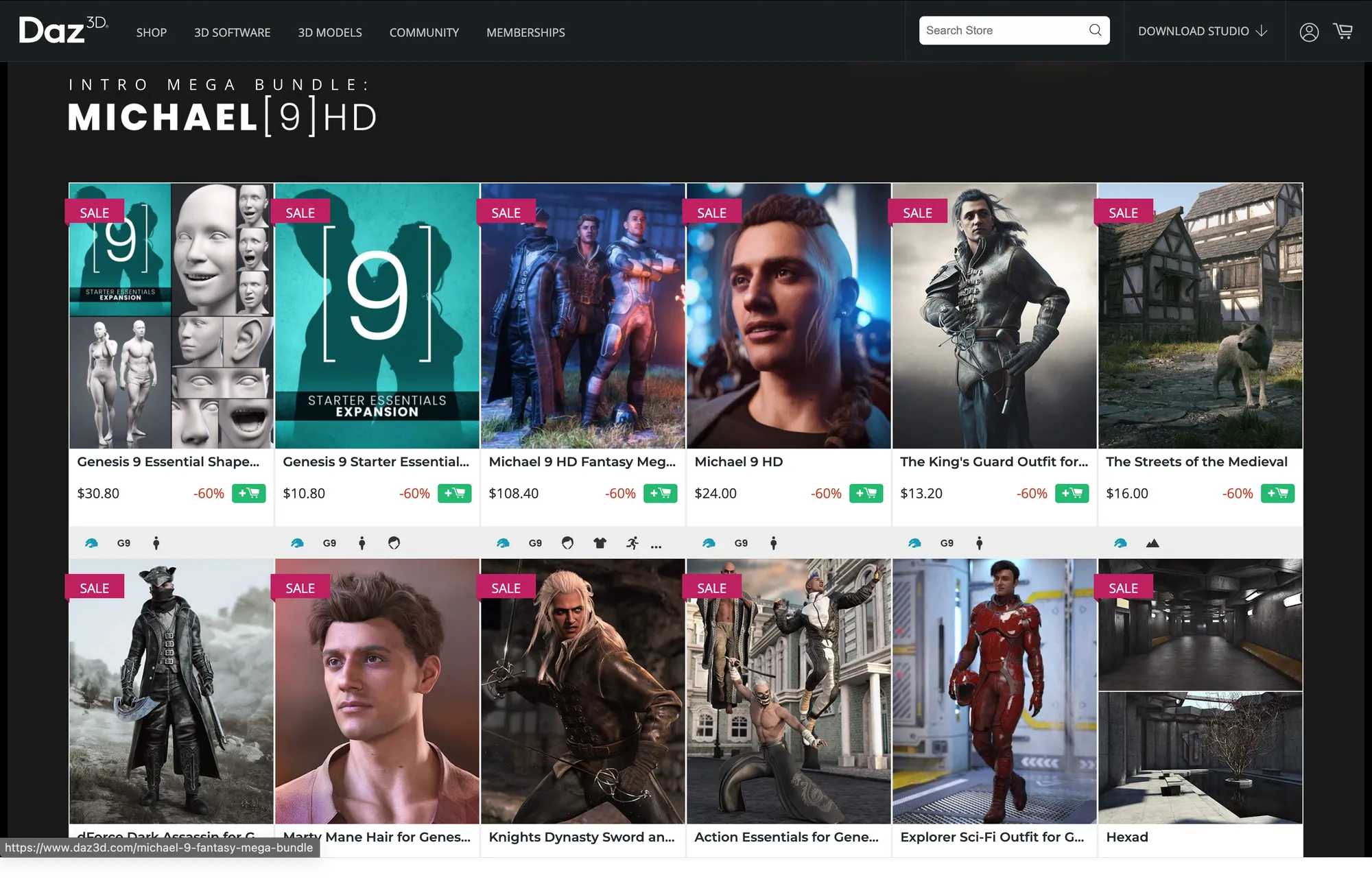
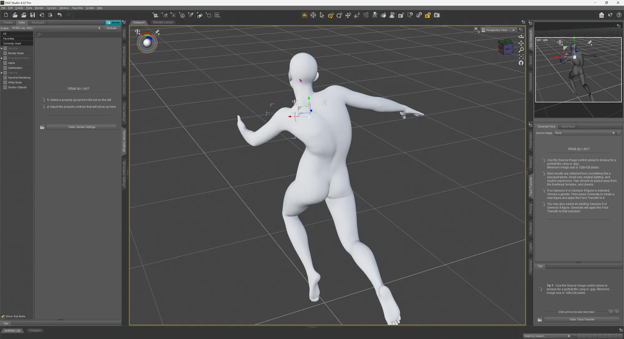
But I decided to try out their 3D software since it was free and it offered access to some free digital characters. And oh boy. Let's just say that the user experience and interface of Daz3D is special.
Character Creator 4
Character Creator 4 by Reallusion offers a slightly more streamlined and less confusing experience for people like me who are just looking to get started. Their free 30-day trial is generous and allows people to really get in the weeds of the software without time pressure. Their 30 character export limit is reasonable but there was a level of uncertainty the first few times I exported my character with Blender.
As per usual with these sort of tools, it's never super straightforward. You have to know that you have to install their CC4 Blender add-on to import their rigged character correctly. And within a few minutes, I had a fully articulable digital character in Blender! After adding a subdivision surface modifier to the mesh, you get an extremely good looking character that renders beautifully with Blender.
Immediately, I noticed that the subsurface scattering on the extremities (especially the fingers) were very pronounced, so I kept the lighting of the character to rim lighting and soft large area lights.
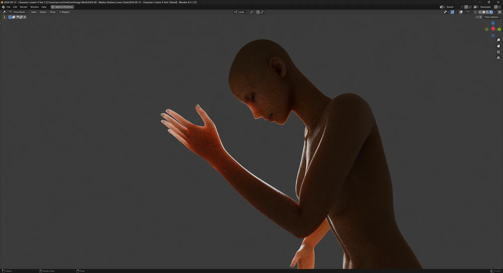
My initial test render with the Character Creator 4 model looked very promising.
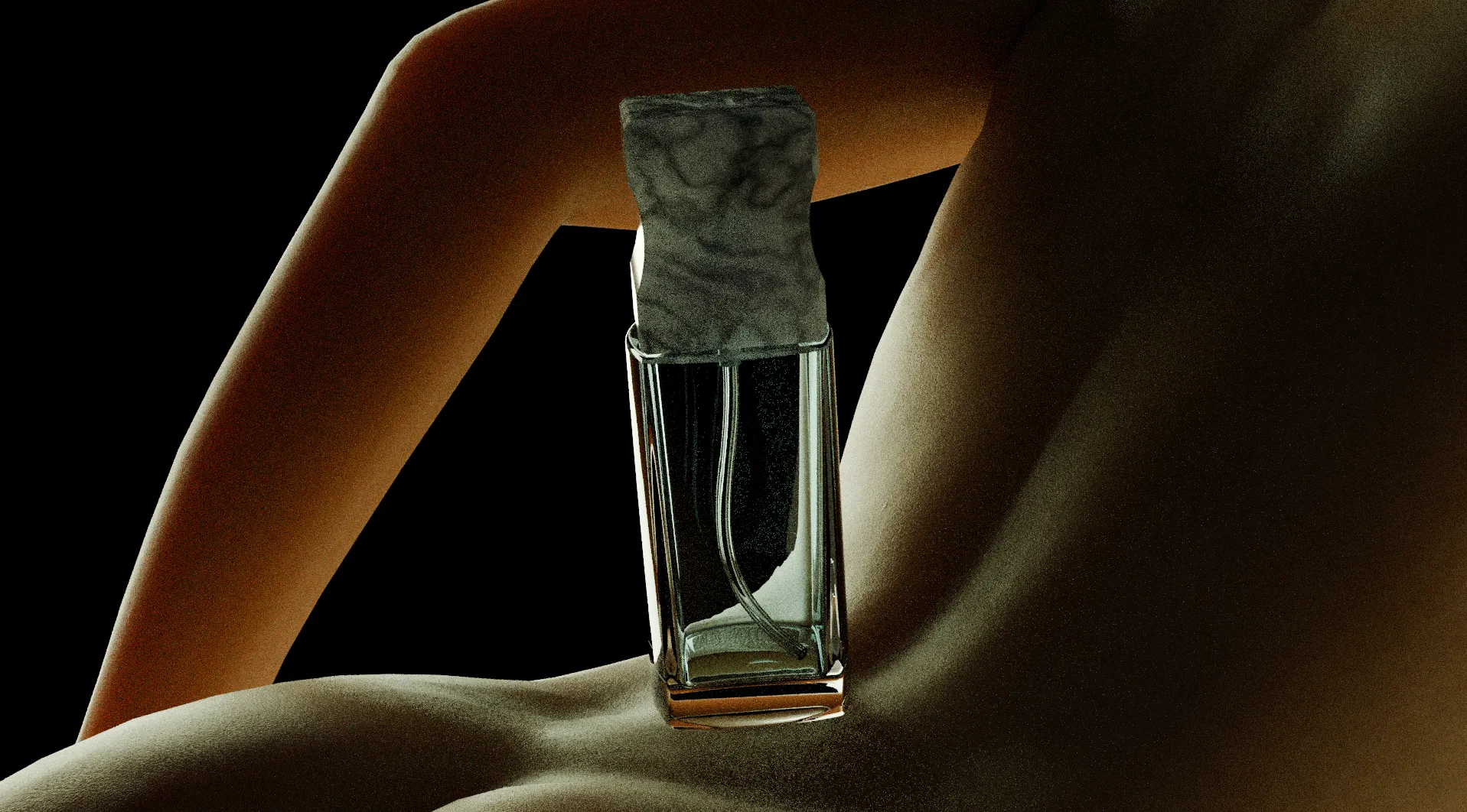
But after soliciting feedback from Matthew, we decided to drop this concept as it was too ambitious to have two characters embrace each other in the shot. I have no knowledge in human anatomy so tweaking the soft deformation on two characters holding each other was out of my skill range for this project.
The concept for the final shot
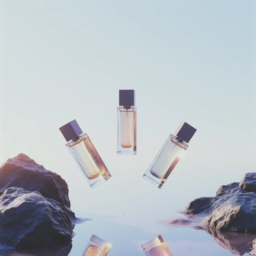
Running out of time and ideas, I went back to basics with the original idea of showcasing the perfume bottle in combination with the theme of water. Matthew and I agreed that we needed an image that showed the perfume bottle in more angles and found this reference that we both liked:
The framing of the shot around the rocks and the array of products showing them in multiple angles was something we both agreed we should draw inspiration from for our direction. With that in mind, I used Flux to generate more concepts featuring multiple bottles over water.
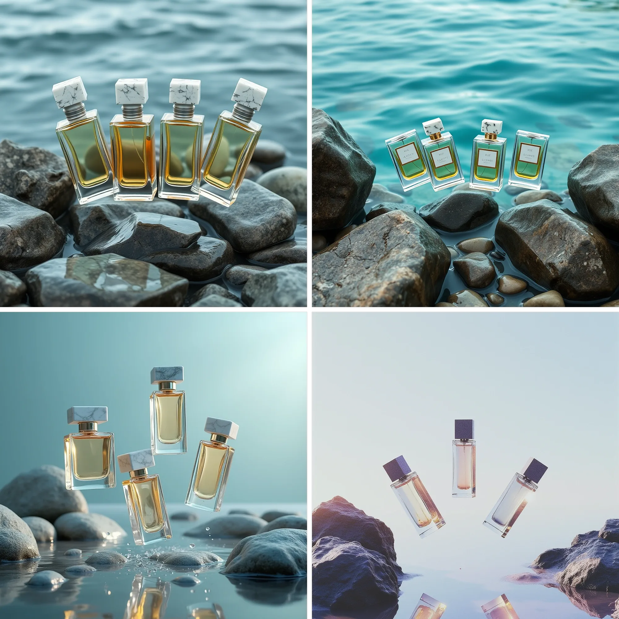
I particularly liked the one below: the simplicity of it, the contrast between the smooth water and the rough rocks. The subtle bloom and glare effects spilling from the side of the frame. And with the water's surface, it was an opportunity to show elements underneath the surface and even more bottles with the reflections.
For this open water shot, I wanted to research how to make the shader for it more interesting beyond a simple glass BSDF. I tried a couple of initial approaches with the Ocean Shader by Chuck CG and the very impressive Physical Open Waters addon I got through this year's Humble Bundle.
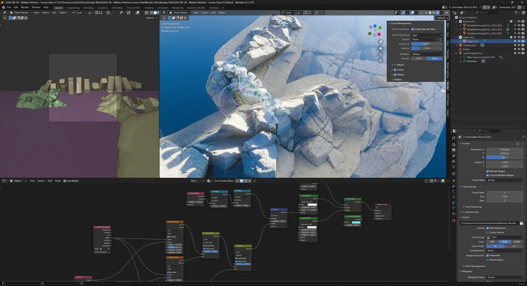
Coincidentally, it was around the same time that Quixel Megascans made all their assets free for use in any software. So along with more procedural methods of generating good-looking rocks, I used some photoscanned assets.
Although the problem was not as visible as with the purchased 3D fruits and props, the rocks also suffered from low resolution textures issues even at LOD0 and 8K resolutions. I wanted to solve this issue by only relying on procedural shaders but having them adapt to the structures of the scanned rocks in the little time I had left proved to be too much. Perhaps I will build my own small library of rocks for the future.
Despite all of these efforts, the overall shot still looked a bit bland. The rocks looked interesting and the lighting put some details and shine on the perfume bottles but I felt that it needed more to get it over the line for the client.
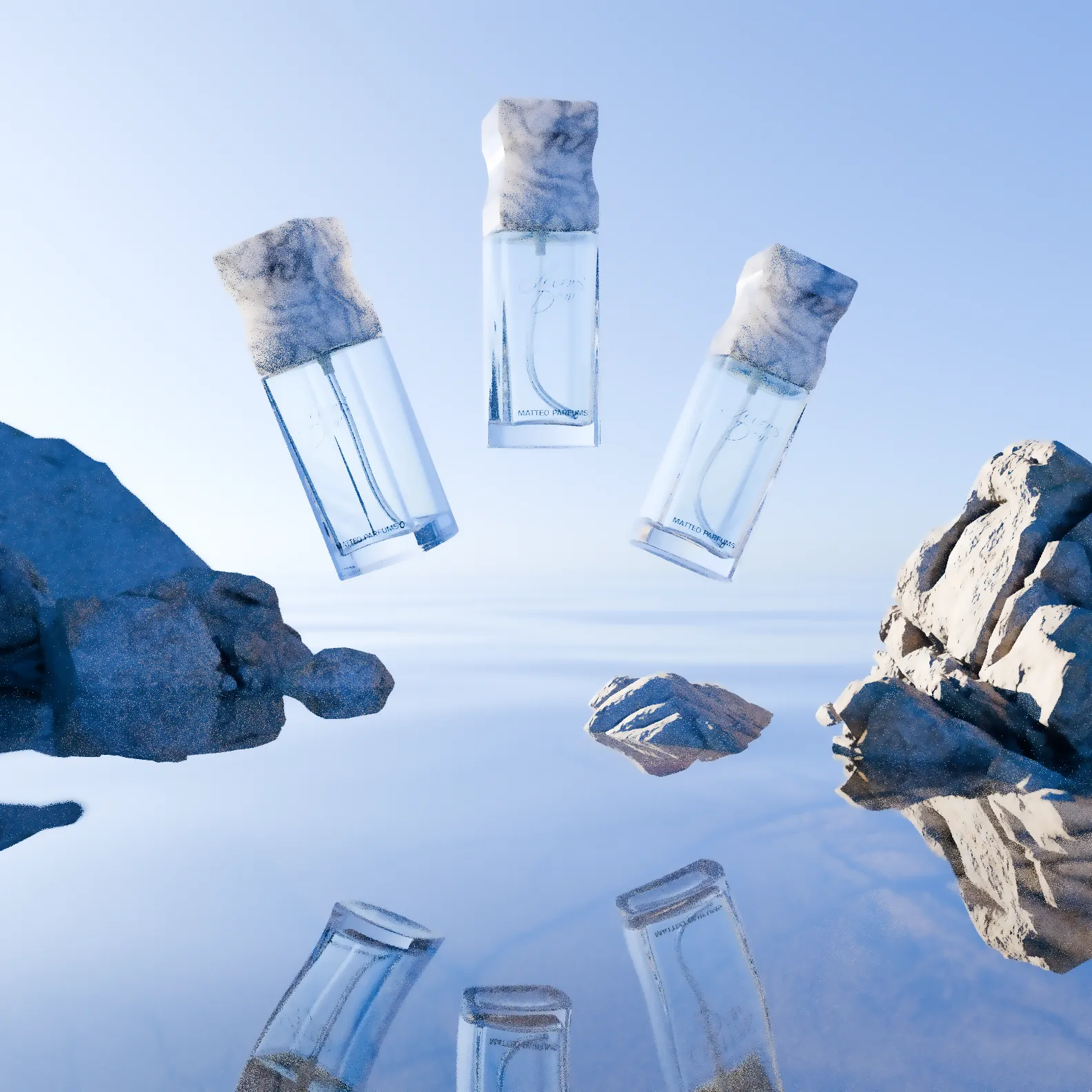
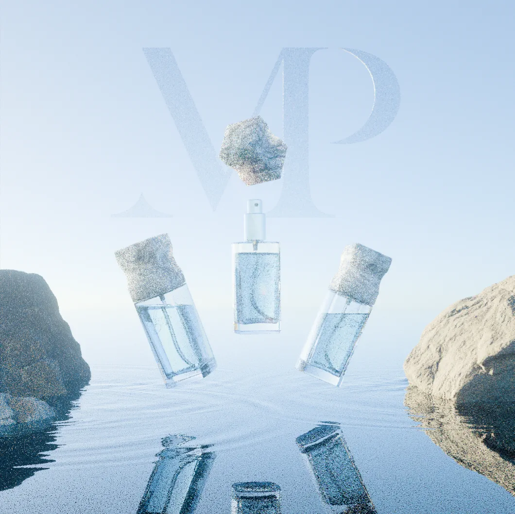
I then proceeded to think about how to add more details that wouldn't grab too much attention away from the perfume bottles such as simulating a little bit of liquid inside each bottle, creating ripples around the rocks and adding references to the brand.
Simulating detailed small-scale fluids quickly turned out to be a fool's errand but i wanted to try it quickly to see how far I could get in an hour. And as expected, the simulations turned out to be uncontrollably chaotic at such small scale.
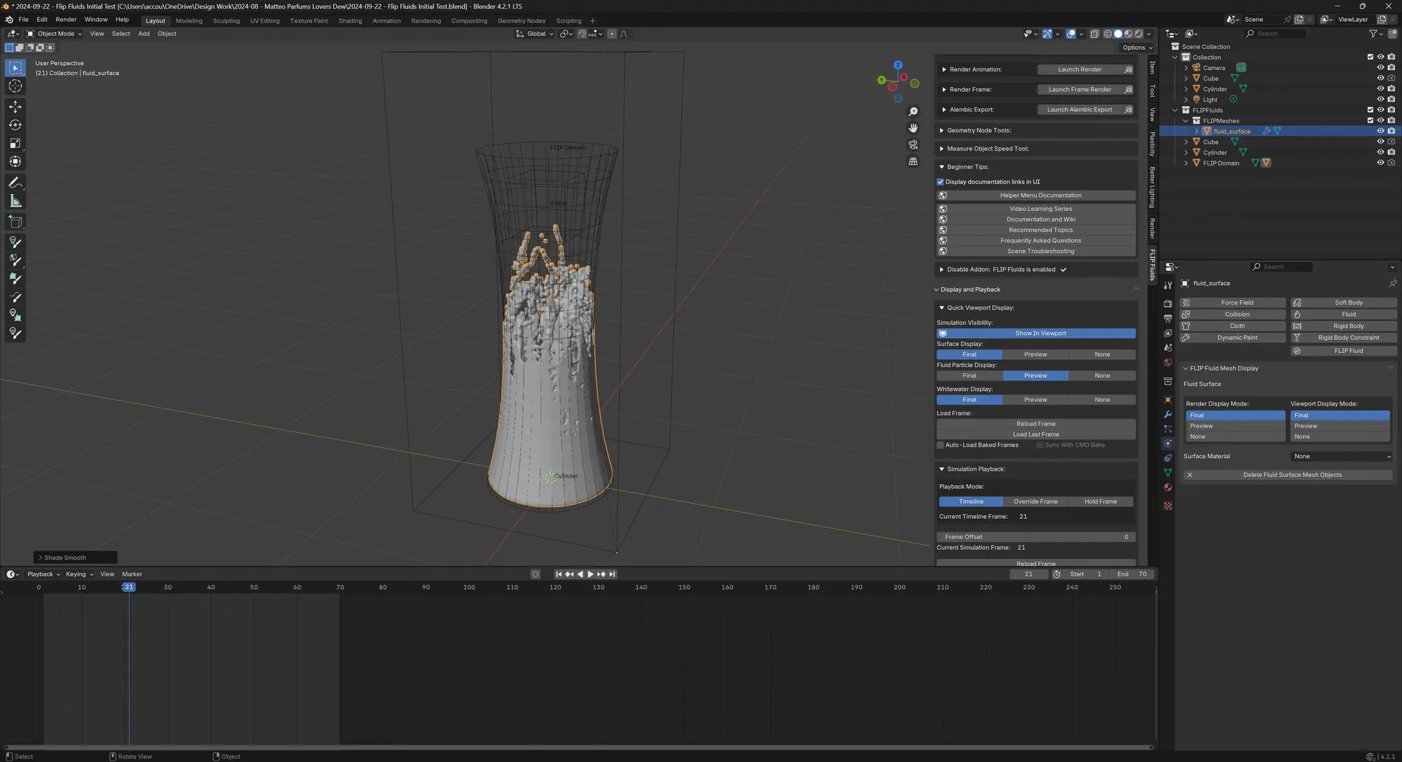
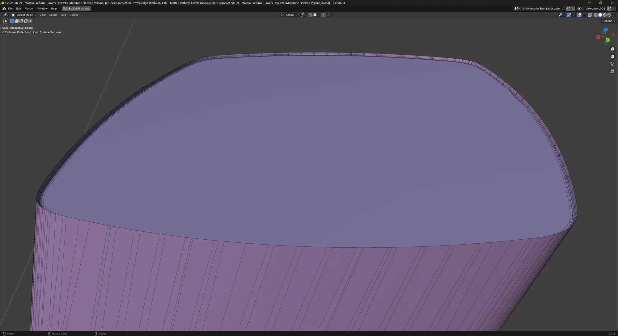
In the end, I modelled a simple liquid mesh using the inside faces of the glass mesh, substracting them with a boolean and manually adding the surface tension with an inset and bevel.
Next, the sky in the background look too empty. The cold blue was a request from the client and the Nishita sky texture inside of Cycles with the right settings gave me the perfect look.
Since clouds were disliked by the client in a previous suggestion, I went for something else: the "MP" wordmark. Because the water was already there, what if I could show the logo reflected on the water's surface?
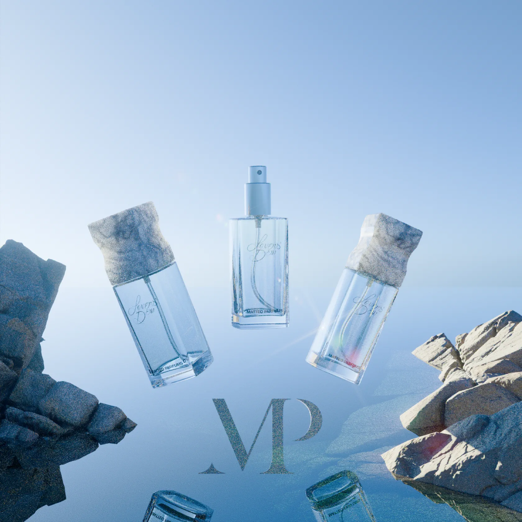
But after a little reflection (pun intended), having the logo placed more prominently but more subtly higher up in the sky. The first attempt made the "MP" stand out too much but with only a little bit of shader trickery, I was able to make it much more subtle.
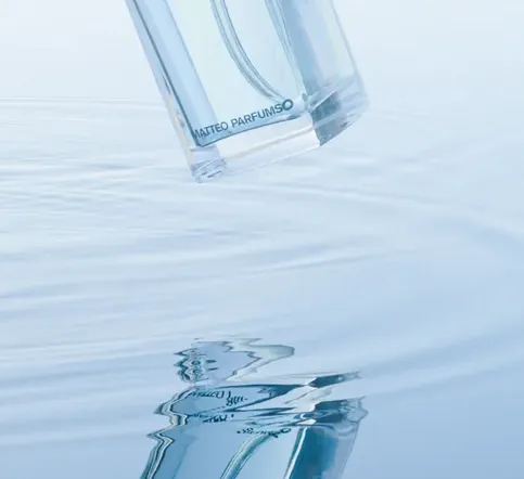
As for the ripples around the rocks just like the bottle liquid, I wanted to avoid doing a fluid simulation. But thanks to Blender's Dynamic Paint system, it's possible to do ripples that accumulate/intersect in a physically plausible way.
Color correction using Render Raw
Blender has recently added GPU compositing inside of the 3D viewport. But after watching "The Secret to Rendering Vibrant Colors with AgX in Blender is the Raw Workflow" from CG Cookie, I understood the value of color correction, and what view transforms are (this other excellent YouTube video called "AgX in Blender 4.0" by Christopher 3D explains what AgX is very well).
In the CG Cookie video, they cleverly advertise their Render Raw Blender add-on which greatly streamlines and simplifies the color correction and post-processing workflow in one convenient group node inside the Compositor.
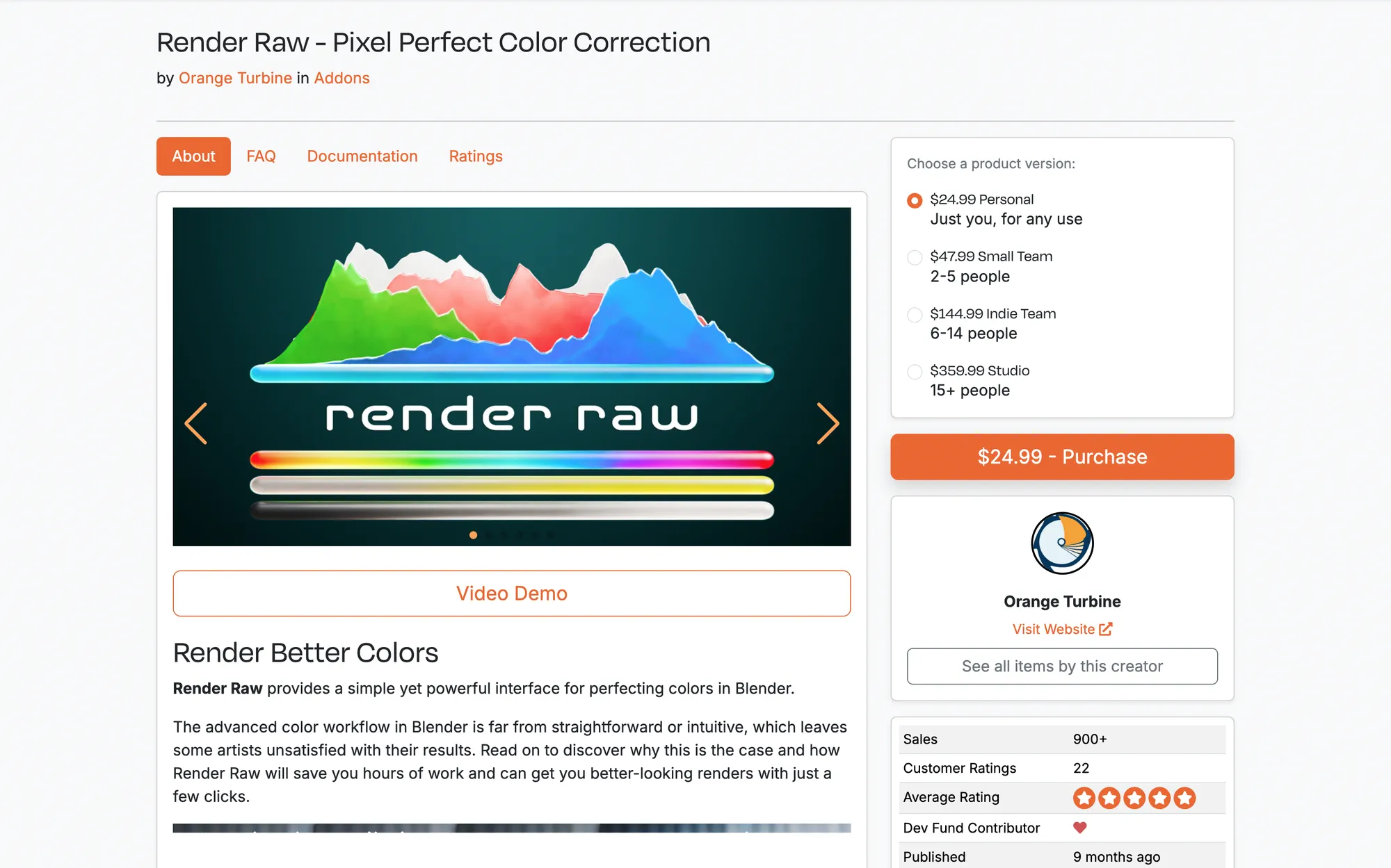
Thanks to Render Raw, I could do all of my compositing mostly in real-time without rendering, without leaving Blender and in 32-bit color depth!
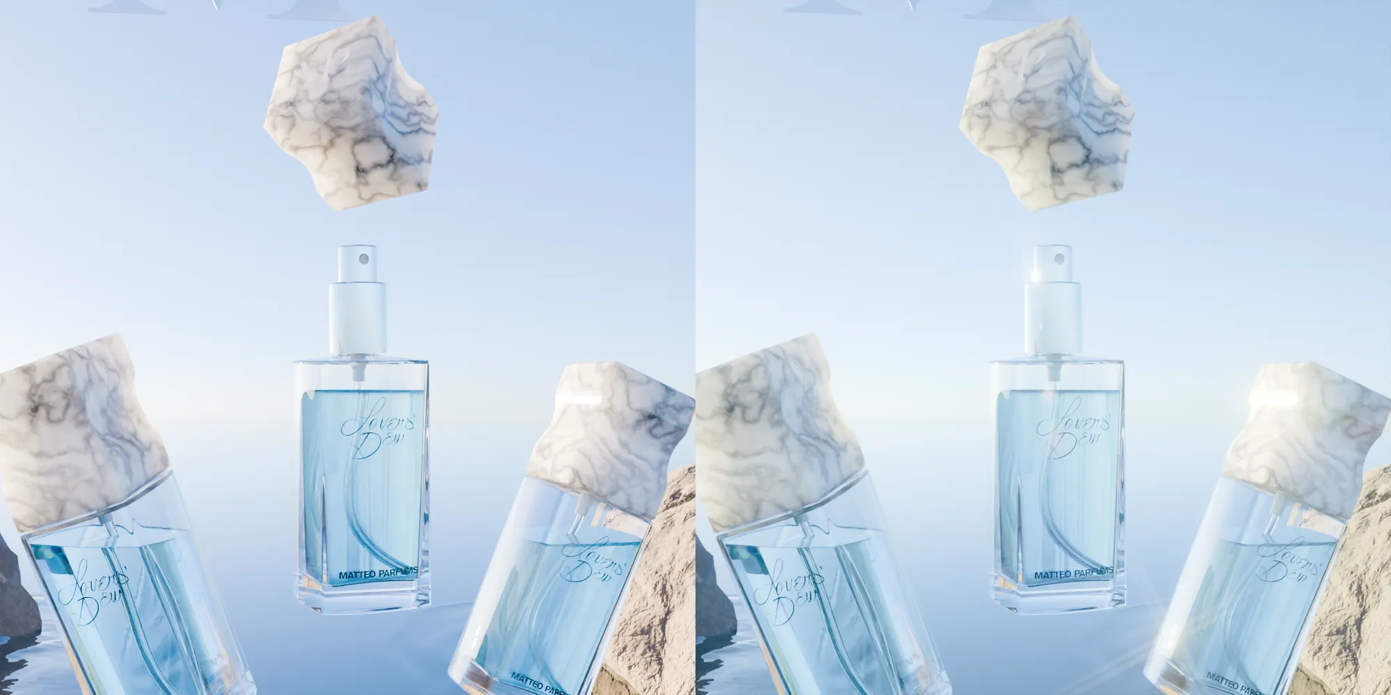
A comparison of the same shot rendered without and with Render Raw
Rendering everything
Blender could do a much better job at simplifying rendering for its users. At the moment, renders are all written into memory and cached renders don't seem to be written to the disk inside of the Render Output and Render Cache directories.
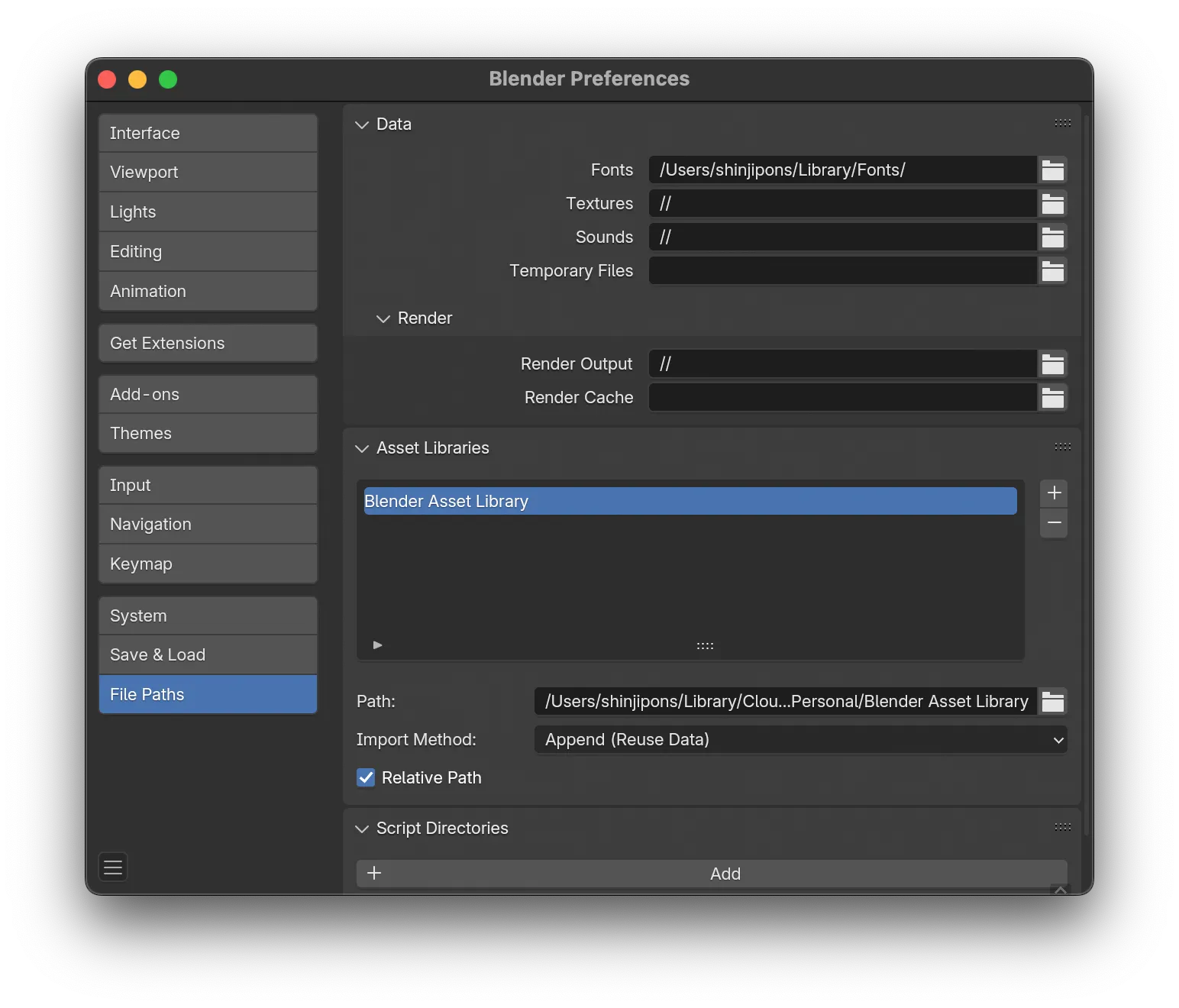
More than once, I've had Blender crash or run out of VRAM so I had to restart from scratch. It would be awesome if Blender were able to checkpoint renders of the same scene as long as the render settings remain identical.
Overmore, the File Output node inside of the Compositor does not seem to work in combination with the Render Raw node, which makes no sense. I need to check if it works using latest on both the add-on and Blender though.
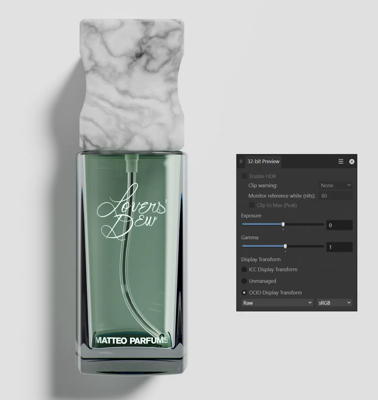
Last but not least, writing your renders to disk in EXR format is much less convenient than I thought. Affinity Photo 2 does not seem to handle the file's color view transform out of the box, making the whole process confusing and painful.
Conclusion
This was my very first time using all of my 3D modelling and rendering skills together for a freelance job. Everything wasn't perfect and compromises had to be made, but done is better than perfect. Some problems were surprisingly frustrating (like the white background problem) and software does not actually solve or accelerate the lack of creativity. But once the ideas were locked down, I loved sitting down and solving away the technical problems of modelling, shading and rendering.